Menu
The site menu is drawer-type, so that it does not occupy a chaotic large part of the screen, but employs special effects to provide easy and comfortable navigation to each custom section.
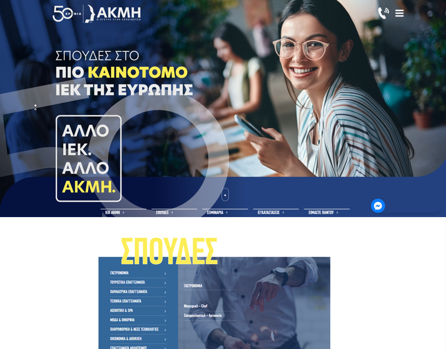
Hero Banner
Regardless of the device used by the visitor, the hero banner occupies the entire screen and fully adjusts to its dimensions. In a very discreet way, it contains basic links as a branch of the basic menu. This helps improve user experience.
Sections & Design
Each section is specially structured with the use of titles and each image has its own character and colors.
In each category, the huge load of information has been smartly allocated so that it does not tire visitors and provides easy and pleasant navigation.
Responsive Design
Either from a mobile device or a desktop, users can navigate quickly and easily on the site, with excellent adaptation of all elements included, to the very last detail.
Directness
Potential students and simple users can find the school of their liking in just 2-3 clicks, with all the information they need. They can also express interest, using smartly located contact forms and links throughout the site.